I almost fell off my seat when I read that complaint about Comic Sans pops up every minute or two. In fact, there’s a joke about Comic Sans, “Comic Sans walks into a bar, bartender says, ‘We don’t serve your type.”
I just wonder what it would feel like creating a font and then getting so much popularity and then hate. Comic Sans was once used as the default font for middle style design work. From a software project at Microsoft 15 years ago to “grade-school fliers and holiday newsletters, Disney ads and Beanie Baby tags, business emails, street signs, Bibles, porn sites, gravestones and hospital posters about bowel cancer”.
Interestingly the maker of the font, Vincent Connare has said, “”If you love it, you don’t know much about typography,” if you hate it, you really don’t know much about typography, either, and you should get another hobby.”
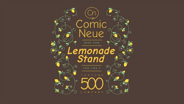
Anyways, Craig Rozynski may have taken on the mother of all type design challenges with his creation Comic Neue. It looks so much better!
Check it out: ComicNeue.com


